Stop Reinventing the Cesium Timeline
Table of Contents
Open Table of Contents
The Cesium Timeline Problem
If you’ve spent any time building geospatial applications with CesiumJS, you’ve run into the timeline problem.
Cesium ships with a built-in timeline widget, and it gets you started. But the moment a stakeholder asks for custom playback speeds, a different datetime format, timezone support, or — god forbid — some kind of event annotation layer, you’re either forking the widget or building from scratch. Neither option is fun.
Building a timeline on top of Cesium from scratch is genuinely painful. You’re dealing with JulianDate conversions, Clock subscriptions, canvas rendering, drag-to-scrub math, edge-scroll behavior, and responsive layout — all at the same time. It’s not impossible, but it’s a multi-week investment that has nothing to do with your actual application.
I’ve seen this problem crop up in nearly every CesiumJS project that goes beyond the tutorial stage. Teams end up with one-off implementations that sort of work, accumulate edge cases, and never get properly maintained.
There’s a better answer: @kteneyck/cesium-timeline.
What Is @kteneyck/cesium-timeline?
It’s a canvas-based timeline component built specifically for CesiumJS — with first-class React and Angular support. The library is structured as three coordinated npm packages:
@kteneyck/cesium-timeline-core— framework-agnostic rendering engine, types, and utilities@kteneyck/cesium-timeline-react— React component wrappers (requires React ≥ 19)@kteneyck/cesium-timeline-angular— Angular 17+ standalone components
The canvas-based approach is intentional. Timeline rendering during playback fires many times per second. Putting that in the DOM means constant reconciliation pressure; putting it on canvas means none of that. The library hooks directly into Cesium’s clock.onTick subscription and redraws efficiently.

Features at a Glance
Before getting into the code, here’s what you actually get out of the box:
Playback controls — transport buttons for skip to start/end, rewind, play/pause, and fast-forward. Configurable forward and reverse speed cycling via ffSpeeds and rwSpeeds props. A speed badge displays the current multiplier.
Time scrubbing — a draggable needle with configurable edge-scroll behavior. Click anywhere on the timeline to seek. Optionally snap the needle to the nearest tick mark.
Adaptive tick labels — the granularity adjusts automatically based on zoom level, from milliseconds up to years. A maxTicks cap prevents canvas overload at extreme zoom levels.
LIVE indicator — activates automatically when the current time is within 10 seconds of wall clock time.
Timezone support — UTC, any IANA zone, or the browser’s local timezone.
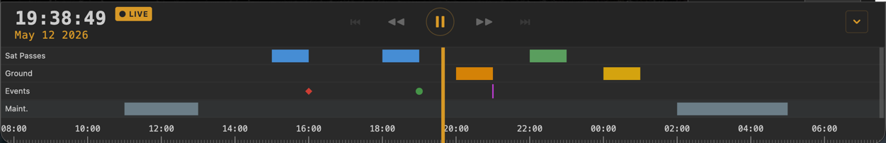
Swim lanes — temporal intervals and instant markers rendered as horizontal rows aligned to the timeline. This is the standout feature and worth its own section below.
Full theming — 16 customizable properties covering colors, fonts, and sizes.
Localization — override any label or tooltip in the control bar.
Responsive — uses ResizeObserver to adapt to container width changes.
Installation
# React
npm install @kteneyck/cesium-timeline-react @kteneyck/cesium-timeline-core

# Angular
npm install @kteneyck/cesium-timeline-angular @kteneyck/cesium-timeline-core
Peer dependency: cesium >= 1.100.
React Usage
The most basic integration wires the component to your Cesium viewer’s clock and connects the three core callbacks:
import { Timeline } from '@kteneyck/cesium-timeline-react';

function CesiumApp() {
  const viewerRef = useRef(null);

  // Assume viewer is initialized and stored in viewerRef.current

  return (
    <Timeline
      clock={viewerRef.current?.clock}
      startTime={Cesium.JulianDate.fromIso8601("2024-01-01T00:00:00Z")}
      endTime={Cesium.JulianDate.fromIso8601("2024-12-31T23:59:59Z")}
      height={120}
      onTimeChange={(t) => {
        viewerRef.current.clock.currentTime = t;
      }}
      onPlayPause={(playing) => {
        viewerRef.current.clock.shouldAnimate = playing;
      }}
      onMultiplierChange={(m) => {
        viewerRef.current.clock.multiplier = m;
      }}
    />
  );
}
That’s it for the basics. The component subscribes to the clock and drives itself. You don’t need to wire up tick listeners or manage redraw cycles manually.
Customizing Playback Speeds
If the defaults don’t match your application’s needs, override the speed sequences:
<Timeline
  clock={viewer.clock}
  ffSpeeds={[1, 2, 5, 10, 30, 60]}
  rwSpeeds={[-1, -2, -5, -10]}
  onTimeChange={onTimeChange}
  onPlayPause={onPlayPause}
  onMultiplierChange={onMultiplierChange}
/>
Custom Datetime Format
The library uses a token-based format system with 17 tokens and several built-in presets:
<Timeline
  clock={viewer.clock}
  dateTimeFormat="DD MMM YYYY HH:mm:ss"
  timezone="America/New_York"
  onTimeChange={onTimeChange}
/>
Built-in presets include DEFAULT, TWELVE_HR, ISO, US, EU, TIME_ONLY, and TIME_12.
Plugging In a Custom Date Picker
The onDateTimeClick callback and jumpToTime function let you attach your own date picker to the displayed timestamp:
<Timeline
  clock={viewer.clock}
  onDateTimeClick={() => setDatePickerOpen(true)}
  jumpToTime={selectedTime}
  onTimeChange={onTimeChange}
/>
Angular Usage
The Angular package exposes a standalone component, so you can import it directly without a module declaration:
import { Component } from '@angular/core';
import { CesiumTimelineComponent } from '@kteneyck/cesium-timeline-angular';

@Component({
  selector: 'app-map',
  standalone: true,
  imports: [CesiumTimelineComponent],
  template: `
    <ct-timeline
      [clock]="viewer.clock"
      [height]="120"
      [startTime]="startTime"
      [endTime]="endTime"
      (timeChange)="onTimeChange($event)"
      (playPause)="onPlayPause($event)"
      (multiplierChange)="onMultiplierChange($event)"
    />
  `
})
export class MapComponent {
  viewer: Cesium.Viewer;
  startTime = Cesium.JulianDate.fromIso8601("2024-01-01T00:00:00Z");
  endTime = Cesium.JulianDate.fromIso8601("2024-12-31T23:59:59Z");

  onTimeChange(t: Cesium.JulianDate) {
    this.viewer.clock.currentTime = t;
  }

  onPlayPause(playing: boolean) {
    this.viewer.clock.shouldAnimate = playing;
  }

  onMultiplierChange(m: number) {
    this.viewer.clock.multiplier = m;
  }
}
The property and event binding API mirrors the React props closely, which makes the library easy to reason about regardless of which framework you’re in.
Swim Lanes: The Feature That Sets It Apart
If you’re building an application that tracks events over time — flight paths, sensor readings, mission phases, alert windows — swim lanes are where this library really earns its keep.
Swim lanes render as horizontal rows above the tick area. Each lane contains items defined as either an interval (a horizontal bar spanning a time range) or an instant (a point marker). Markers support three shapes: diamond, circle, or vertical line. Styles cascade from theme defaults down through lane-level and item-level overrides, so you can theme everything globally and selectively override per-item.
const swimLanes = [
  {
    id: 'mission-phases',
    label: 'Mission Phases',
    items: [
      {
        id: 'launch',
        label: 'Launch Window',
        interval: {
          start: Cesium.JulianDate.fromIso8601("2024-06-01T08:00:00Z"),
          end:   Cesium.JulianDate.fromIso8601("2024-06-01T10:30:00Z"),
        },
        style: { color: '#4ade80' }
      },
      {
        id: 'separation',
        label: 'Stage Separation',
        instant: {
          time: Cesium.JulianDate.fromIso8601("2024-06-01T08:45:00Z"),
          shape: 'diamond',
        },
        style: { color: '#f97316' }
      }
    ]
  },
  {
    id: 'telemetry-alerts',
    label: 'Alerts',
    items: [
      {
        id: 'overheat',
        label: 'Thermal Warning',
        instant: {
          time: Cesium.JulianDate.fromIso8601("2024-06-01T09:12:00Z"),
          shape: 'circle',
        },
        style: { color: '#ef4444' }
      }
    ]
  }
];

<Timeline
  clock={viewer.clock}
  swimLanes={swimLanes}
  showSwimLanes={true}
  onSwimLaneItemClick={(item, lane) => console.log('clicked', item.label)}
  onSwimLaneItemHover={(item, lane) => showTooltip(item)}
  onSwimLaneReorder={(lanes) => setLaneOrder(lanes)}
  onTimeChange={onTimeChange}
/>
Users can also drag lanes to reorder them, with the new order surfaced via onSwimLaneReorder. For any application that overlays temporal event data on a Cesium globe, this replaces a lot of custom work.
Theming
The component accepts a theme prop with up to 16 customizable properties. You can match your application’s design system without fighting CSS specificity:
<Timeline
  clock={viewer.clock}
  theme={{
    backgroundColor: '#1a1a2e',
    tickColor: '#4a4a8a',
    tickLabelColor: '#a0a0d0',
    needleColor: '#e94560',
    playButtonColor: '#0f3460',
    controlBarBackground: '#16213e',
    liveIndicatorColor: '#e94560',
  }}
  onTimeChange={onTimeChange}
/>
Combined with the labels prop for text overrides, you can fully localize and brand the component without touching library internals.
Why You Should Just Use This
The honest argument is simple: if you’re building any CesiumJS application that needs more than Cesium’s default timeline, you’re going to spend time on this problem one way or another. The question is whether that time goes toward your application or toward reinventing a timeline widget.
The @kteneyck/cesium-timeline library covers the hard parts — canvas rendering, Clock synchronization, edge-scroll behavior, adaptive ticking, swim lane event data, responsive layout — and exposes a clean, well-typed API for React and Angular. It’s MIT licensed. It requires no proprietary dependencies beyond CesiumJS itself.
The swim lanes feature in particular is something I’ve seen teams build from scratch more than once, and it’s never as clean as having it baked into the timeline component from the start.
Links: